And people who are uglier than you and I
They take what they need, and leaveThe Smiths, “A Roush And A Push And The Land Is Ours”
If you want to offer downloadable files to your user, how do you perfectly wrap those for all of them? Just putting a hyperlink around a file name seems so outdated. With modern HTML5, this can be made much better and more accessible.
TL;DR
- Semantically, the download is always a Hyperlink (
<a/>), never a<button>. - Provide media type visually readable
- Provide file size visually readable
- Use icons & color to enhance visual presence
target=”_blank”- Semantical enhancement with HTML5
See the final result here with the working code examples.
To <button>, or to <a/>, is that the Question?
The first thing that comes up here is the correct semantics of a download. Are we talking about a link here or is this rather a button?
You might argue that a click that obviously opens a plugin like Adobe Acrobat Reader could also be triggered by a button like in an application that opens a widget. There has been a long lasting discussion about this issue. But there is a pretty definite decision by the W3C on the fact, that downloadable files should be represented by links.
Be aware: by clicking a link you always “download” some data. This is in most cases HTML. On other file types you are leaving the context of the current page in the same way, as if you would move to another HTML page. And this other resource is a file as well, but it might not be HTML. Then the browser can’t display it on your screen and decides to start downloading it to your hard disk, which is the browsers default behaviour. The special use case with download links is that users want to save the file for later on their computers. And this what the browser always does by keeping even HTML files in the cache temporarily, even if it does not obviously download anything.
So with this said links are the webs fundamental base since ages now. And still links can be confusing and misdirecting in design and content, especially for people using assistive technology. The wise people at WCAG already provided help to address this issue in version 1.0 of their guidelines. Even the brand new WCAG 2.1 features information on this. And still with the multiple new semantic features of HTML a link on a document other than HTML is technically and semantically the same.
Why is this special Treatment so important?
Not only, because of accessibility reasons, but of regular usability reasons as well. Mostly, because browsers react differently on different contents that are linked:
- Download links can open Plugin-Frames in the browser window (e.g. PDF), which might be confusing, if you’re not aware clicking a download link.
- If you click on an image file, it is enlarged to its maximum size in the browser window, which makes the user feel like leaving the site.
- Download links might be downloading the file immediately without announcing anything or changing view on the site obviously.
- Sometimes clicking on download links opens a dialog, where users can decide, whether to download the file, open it in the browser or stream it.
I watched my dad, who is a so called “silver surfer” and an occasional user of the WWW clicking his first download link which was not obviously pointing to a PDF file. He twitched a little when he realized, that the download was in progress and asked me “What happened?”. - There is different UI handling throughout the browsers
- Mostly, the visual feedback of a download procedure is located elsewhere in the browser window and not obvious enough (e.g. in the header toolbar in Firefox, in the footer and header toolbar in Chrome and in the footer with a pretty prominent bar).
UI in Firefox ESR on Windows 7
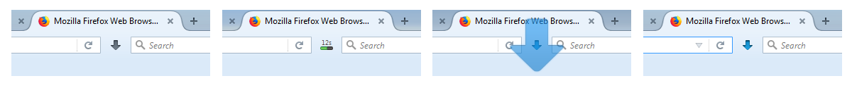
- Intial state, indicated by a grey arrow pointing downwards.
- Downloading in progress, in the example 12 seconds left.
- Downloading completed, indicated by an animated and expanded blue arrow pointing downwards.
- Download ready but not yet opened, indicated by the now blue arrow.
In my opinion, this this whole user interactions is way too unobstrusive and maybe confusing for some users. If your focus is on the bottom section of the page and you click on a download, you might not notice this small animation or the progress of the download.
UI in Firefox 58 on Windows 7
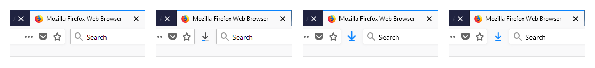
- Intial state, nothing here, that could indicate a download UI.
- Downloading in progress, indicated by an arrow pointing down on a smallish progress bar.
- Downloading completed, indicated by an animated and expanded blue arrow pointing downwards.
- Download ready but not yet opened, indicated by the now blue arrow.
This new UI is even less unobstursive. The progress bar is way to small to even recognize it as such a UI.
There are even more UIs for downloading files. Maybe every browser has its own. But keeping this in mind, that is the reason, why you shoult make a download link more obvious for the user!
UI in Chrome 64 on Windows 7
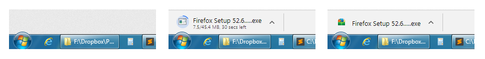
- Intial state, nothing here (footer section), that could indicate a download UI.
- Downloading in progress, indicated by full width bar, left it contains a block with file name and expected download time left counting down. Additionally an animated progress circle.
- Downloading completed, indicated by the file name with corresponding icon. Arrow pointing upwards to interact with the downloaded file (open, show in folder etc.)
In Chrome, the UI is way better, because it is placed in a more noticable styled full width bar in the bottom section of the browser window. More info is shown on the download and its progress.
Provide the the File Type aka MIME Type aka Media Type
Following the WCA guidelines it is a good practice keep the user informed about the purpose of the link. Translated to download links, it is first of all necessary to inform the user about the documents title, and not offer a linked file name of human unreadable spaghetti text. It is also considered good style to inform about the special content type featured behind that link.
So if you want to offer some PDF documents to download, you should communicate this to the user. It should be the users choice to click on the link, because only the user knows, if there is additional software available on the computer to display this kind of files and if this is the desirered file format.
So you might want to make a download like this:
<a href="important-document.pdf">Important document (PDF)</a>Use proper HTML Semantics
If you want to inform the user about the file type behind a link by just writing the file ending into the link, this can cause additional barriers, because the file ending acronym that you used might be unfamiliar to the user. So it is important to explain the abbreviation via HTML semantics. Alternatively you can define the abbreviation in the text, when it is first used.
  <a href="important-document.pdf">
    Important document (<abbr title="Adobe Portable Document Format">PDF</abbr>)
  </a>
And don’t be too pedantic here. It is OK to give more information on the file, like the company behind the file offering plugins to read it in this PDF example.
What type are you?
And you can create an even better experience by adding the type attribute with the correct MIME Type like this:
<a href="important-document.pdf" type="application/pdf">
  Important document (<abbr title="Adobe Portable Document Format">PDF</abbr>)
</a>
This attribute has only informal character by now, but it can be useful to users with assistive technology in the future and makes the download link semantically bulletproof.
To enable this programmatically on your website or app, you might want to be aware of the existing media types of the web. Although in German, you can find a pretty complete and practical overview on Self-HTML. A rather basic list is featured on MDN. If want to dive really deep, there is a complete list on IANA. And if you’re workin in a node environment, there is a pretty nice mapping tool on Github.
File Size is important at first Glance
Additionally, it is considered good user experience to inform users about the file size that awaits behind the click. Because in a slow mobile network or under a lower bandwidth in a developing country, it can be of great interest even to technically less advances users, if the file download is only some bytes or 20 gigabytes large taking seconds or hours to complete.
So you might want to add some file size info like this to you code:
<a href="important-document.pdf" type="application/pdf">
  Important document (<abbr title="Adobe Portable Document Format">PDF</abbr>, 27.5 <abbr title="Megabyte">MB</abbr>)
</a>.
In a modern web application you would want to have a universal solution to transform the byte size you get from your backend service into correct numbers and and human readable output. There is quite a good solution for converting bytes into the desired style on Stackoverflow.
Indicate File Type with graphic Icons
It can be helpful, to create icons for the different file types that you want to support in your website/app. As a visual anchor for sighted users that can enhance the user experience and make finding special file types easier.
From an accessibility perspective, you can leave out any semantic info on the icon (e.g. title elements in SVGs), because you already feature machine readable info elsewhere. It is therefore OK as well to use different colors to indicate different file types here, e.g. red for Adobe PDF, green for Microsoft Excel etc. and other colors related to the software that it was created with. This can help visually oriented people, who might only scan the document to easier identify those links as downloads and quicklier distinguish between the different file types they wish to download.
There was a great discourse on what type of image metaphor would best represent a downloadable file. After the use of floppy discs declined to zero, a younger generation no longer recognized this image as a file.
In Germany, there was a design contest on redesigning the old floppy disk symbol into something more recognizable. This was the result:
You might want to represent the file by showing the brand logo that is used with the software it is created. But it happens, that you offer to many file types and you can’t have a logo design for all of those. At least you should use something like this more basic download icon as some kind of fall back.
May I open the Download in a new Browser Window?
So now that we have style the download link, where should it be opened? In the same window/tab or in a new one? There has been a lot of discussion on this in the UX sphere of the web. The most distinctive speaker for UX, Jakob Nielsen speaks out for opening download links in a new browser window:
[…] users feel like they’re interacting with a PC application. Because users are no longer browsing a website, they shouldn’t be
given a browser UI.Jakob Nielsen, “Open New Windows for PDF and other Non-Web Documents”,
Nielsen contradicts himself in a later article (2011) on that topic by stating:
Opening up new browser windows is like a vacuum cleaner sales person who starts a visit by emptying an ash tray on the customer’s carpet. Don’t pollute my screen with any more windows […] But even disregarding the user-hostile message implied in taking over the user’s machine, the strategy is self-defeating since it disables the Back button which is the normal way users return to previous sites. Users often don’t notice that a new window has opened […]
Jakob Nielsen, “Top 10 Mistakes in Web Design”,
But the most countable argument against opening a new window is that mostly people with assistive technology get confused, when a new window opens automatically. It should be left upon the user’s choice, whether to open a link in the same or a new window, because the browser offers this functionality by default.
If you are forced to open a new window by design or by the product owner, you should definitely announce that at least machine readable to the user, even better readable for all users.
Semantical enhancement
But is that the final semantic truth? I think not. HTML5 has to give more.
The download Attribute
With their HTML5 specification, the W3C enhanced the <a/> element by creating the download attribute. By using it alone, it semantically indicates, that the author of the page wants this link resource to be downloaded.
<a href="important-document-2018-02-20.pdf" download>Important Document</a>It also offers the opportunity, to define a more usable separate name, that will be set, when the user downloads the file. This is extremely helpful in environments, where a file name has to be very unique on the server and therefore appears to be less human readable and useful to the users. And on a users computer it makes sense to keep it readable and therefore findable.
<a href="gHxe27G2jkLme34Bb12469.pdf" download="important-document.pdf">Important Document</a>Note: this does not work, if the HTTP header Content Disposition provided by the server gives a different file name here. Additionally you have to use same-origin URLs for your download link. By the time of writing this (), the support for the download attribute was still quite incomplete, especially in IE and Mobile Safari on iOS. Nevertheless, you should use it anyway for better future proofing your link!
The <figure> and the <figcaption> Element
Most of you might have used the figure-figcaption combination on images to correctly assign descriptive text to them. If you think one step back, download files are nothing else, although most of them can not be shown inline in the document. So why not wrap the download link in a figure tag in the same way?
As we learned before, they have special needs to be described by file type and size. And maybe you would like to provide additional descriptive information (release date, copyright holder etc.). The figure element provides the right native HTML5 semantic connection between an element and its description, without using ARIA or any other “tricks”. And it is pretty well supported throughout the browser and assistive technology ecosphere.
This combination makes the the download link and it’s associated information easier to access by users with assistive technology. On the other hand new container elements around the link can make it easier for developers to visually code the design around the pure information behind that.
<figure>
  <a href="gHxe27G2jkLme34Bb12469.pdf" download="important-document.pdf" type="application/pdf">
    Important document
  </a>
  <figcaption>
    <abbr title="Adobe Portable Document Format">PDF</abbr>,
    27.5 <abbr title="Megabyte">MB</abbr>,
    <time datetime="2018-02-20">February 20th, 2018</time>
  </figcaption>
</figure>
Some more semantic and interactive sugar on top
I added some additional CSS & HTML magic to the <abbr> elements. Just a simple tabindex="0" and some CSS on :after for :hover and :focus event, creating a nice tooltip. This helps keyboard or touch device users to easily access the title attribute on the <abbr> element. A little sidenote: it’s better to put the tooltip text into the :after pseudo element to make sure, the abbreviation is read first and then the tooltip explanation.
If you want to dive deeper into that topic, Adrian Roselli created similar stuff for accessible emoji.
I also encountered, that not all assistive technology reads the figcaption element by default. I enhanced it with an id an let the download link refer to that via aria-describedby.
| Firefox 59 | Chrome 60 | Firefox ESR (52.6.0) | IE 11 | Edge | |
|---|---|---|---|---|---|
| JAWS |
works partly
|
works partly
|
doesn’t work |
works |
works
|
| NVDA 2018.1 |
works |
works partly
|
doesn’t work |
works |
works |
| Narrator |
works
|
works
|
works
|
works partly
|
works partly
|
| Firefox 59 | Chrome 65 | Samsung Internet 7 | |
|---|---|---|---|
| TalkBack 6.1 |
doesn’t work |
works
|
works |
Final result
Here you can find a more complete version. Please note: as I’m referring from codepen.io to my private blog site, the download attribute does not work here, because of cross origin links.
See the Pen Proposal for a more accessible Download Link by Accessabilly (@accessabilly) on CodePen
You can find the working example and the source code of it here.
If you want to download the code, refer to my Github repository page.
Further Reading
- Gian Wild on Sitepoint about what to consider to produce accessible links: Making Accessible Links: 15 Golden Rules For Developers
- Eric Bailey on CSS Tricks about almost the same topic, a little less on accessibility: Building a Good Download… Button?