But you’re in the wrong skin
And the skin that you’re in says
Oh, let it begin
And earth is the loneliest planet of allMorrissey, “Earth Is The Loneliest Planet”
So you want to start a web project and accessibility is one of its core requirements? Here is an overview of stuff you might want to consider before you write a single line of code. Those are things I came across with a lot of web projects and I wished I had considered earlier.
Experience has shown that it is very important to enclose accessibility in every step of your project from the very beginning on, like conception, design, development and testing. It is very time-consuming or even impossible to implement accessibility after a product is “ready”, since this can mean a change in technology or even a completely new implementation. Accessibility right from the start avoids major delays in releases and enables shorter release intervals (time-to-market).
Preliminary legal & organizational Considerations
- The level of WCAG (Web Content Accessibility Guidelines) conformance (A, AA, or AAA) should be determined together with your client or the agency that provides you with the web service. I recommend sticking at least to an AA conformance. For example, this is the level the German BITV 2 (Barrierefreie-Informationstechnik-Verordnung) is based on. The legal situation may be different, but WCAG 2.1 level AA conformance is the base rule in most countries around the world. So if you stick to this with your project, you should be fine.
- By the time writing this WCAG 2.2 is not the current web standard yet, but almost finished. Consider supporting the new success criteria there as well early. In the European Union for example, the standard is being revised for the implementation of the European Accessibility Act. As part of this revision, it will be updated to WCAG 2.2 as well. Their schedule suggests that publication of the new EN 301 549 (European Norm) in the Official Journal of the European Union will not happen until late 2025 or early 2026. Anyway, I will always refer to the newer requirements in this post here.
- If you’re developing a website for a country in the European Union (EU), you will have to provide an accessibility statement (see the EU Web Accessibility Directive, Article 7 1). Check in advance whether you have the editorial capacity and enough knowledge about the accessibility of your site to be able to write the statement yourself or to support or advise your customers in doing so. At least some generators are also offered on the net to create accessibility statements.
- Plan a budget for accessibility. Don’t get me wrong: accessibility does not have to cost extra. But if you’re not an expert on the subject and you or your development team will need special training, accessibility consulting or extra development time, so more budget can be helpful.
- Plan time for testing and auditing. It takes a lot of time effort to run tests, conduct audits and incorporate the findings into the project.
- Know your users: Do they use special assistive technology like speech recognition software, a Braille display or a switch device? What kind of screen readers do they use? Make sure, you use the same software in the same version and have at least basic knowledge of its usage. Better test your software with those “real” users advice.
- Which browsers and platforms in which versions do you want to support? For example for German public authorities Firefox ESR (Extended Support Release) is important for security reasons. Many screen reader users depend on JAWS (Job Access With Speech) and Chrome on Windows. Are those devices and software available for you for testing and debugging?
Read more on legal Accessibility Stuff
The Paciello Group (TPGi), Marissa Sapega: Lower Your Legal Risk and Improve the User Experience of Your Site
Design Process
If you are planning to design a website, your decisions can impact the accessibility of your product from the beginning of this process. During the process of making wireframes or mockups, you can already think about the things listed here and try to develop concepts.
Input Device agnostic
User interactions should not be limited to one input method. Users should be able to choose freely how to interact with the system you are designing. For example interactions should never depend on the mouse only.
- If you’re building a drag and drop interface, provide buttons to move items, because keyboard interactions should work as well. See this new success criteria in WACG 2.2
- Avoid buttons or other interactive elements which consist of iconography only and have no visible name. Speech recognition users may depend on clear visual naming of buttons to easily and successfully complete interactions. If you cannot avoid their use, consider what has been written in this article by Sara Soueidan: Accessible Icon Buttons
- Ensure enough target size for interactive elements like buttons. A basic size of 24 Pixels will be provided in the upcoming success criteria of WCAG 2.2. You help users with dexterity limitations and those who have difficulty with fine motor movement or just users on mobile devices operating with their fingers.
- Design your focus indicator! Many designers don’t like the browser’s default focus indicator and especially they don’t like it, when it appears on click. Many developers are forced to use something like
outline: none;against better knowledge. But this is a huge barrier for keyboard users! Make the designers aware early on that they can live out their creativity here to design clear visual help for keyboard users. And you can calm them: Modern CSS (Cascading Style Sheets) makes it possible to only show the indicator on focus. WCAG 2.2 has some new design requirements on focus indicators, too.
Example: Focus Indicators not visible on Click
  *:focus, *:focus-visible {
    outline: thick double deeppink;
  }
  *:focus:not(*:focus-visible) {
    outline: none;
  }
Read more on the Design of Focus Indicators
Sara Soueidan: A guide to designing accessible, WCAG-compliant focus indicators
Responsive Design
There is an almost unlimited number of devices with a huge variety of screen sizes available on the market. More users use mobile devices than desktop computers nowadays. If you’re planning a new design, think of the different viewport sizes early. Positions of elements on the page can change or resize to use the available screen area in a user friendly way.
- Don’t restrict orientation change of the website! Let it smoothly adapt to different resolutions. Allow all users to zoom.
- Make sure that the reading order doesn’t change in different breakpoints.
- Avoid spatial clues! Something like “Click the button on the right” may no longer make sense under other conditions of your layout. Especially for blind users those clues are completely useless.
Example: let Users zoom into the Website
<meta name="viewport" content="width=device-width, initial-scale=1">Color and Contrast
The designer of your project should make sure that all text colors have enough contrast to their backgrounds, at least a minimum ratio of 4.5:1. There are a lot of helpers out there to keep an eye on the contrast:
- Color Contrast Checker by WebAim
- Color Contrast Analyser by the Paciello Group for Windows and MacOs
- Color Contrast Analyser for Sketch
- Check Contrast Ratio for Adobe Photoshop
Pro Tips
- Don’t use color alone to transport meaning. Something like a green button to submit a form and a red button to cancel the transaction is confusing for color-impaired people. Your design should be working without color or with the colors users chose as their settings in the browser.
- Avoid using images containing text! If you have to place text over images via markup and CSS make sure, there is always enough contrast to the underlying image by using additional (semi transparent) background colors.
- All focused elements in your website should be perfectly visible and not obscured to make it easier for keyboard users to navigate and determine their location on the page. Design a clear focus indicator early that is of good contrast to all of your background colors to highlight all interactive elements. A one pixel dotted border is considered being too unobtrusive.
- Underline all the inline links in a text block for perfect readability. Color alone is not enough to determine whether you have a link or not. Bold text for links is not a good alternative, because other parts of your texts might be bold as well and are not always links (especially headings).
Structure and Markup Architecture
Semantic Structure
The structure of your site is not only of visual importance. Blind users rely on structural information as well. Modern HTML (Hypertext Markup Language) provides all possibilities to provide all users with an understanding of your site’s structure.
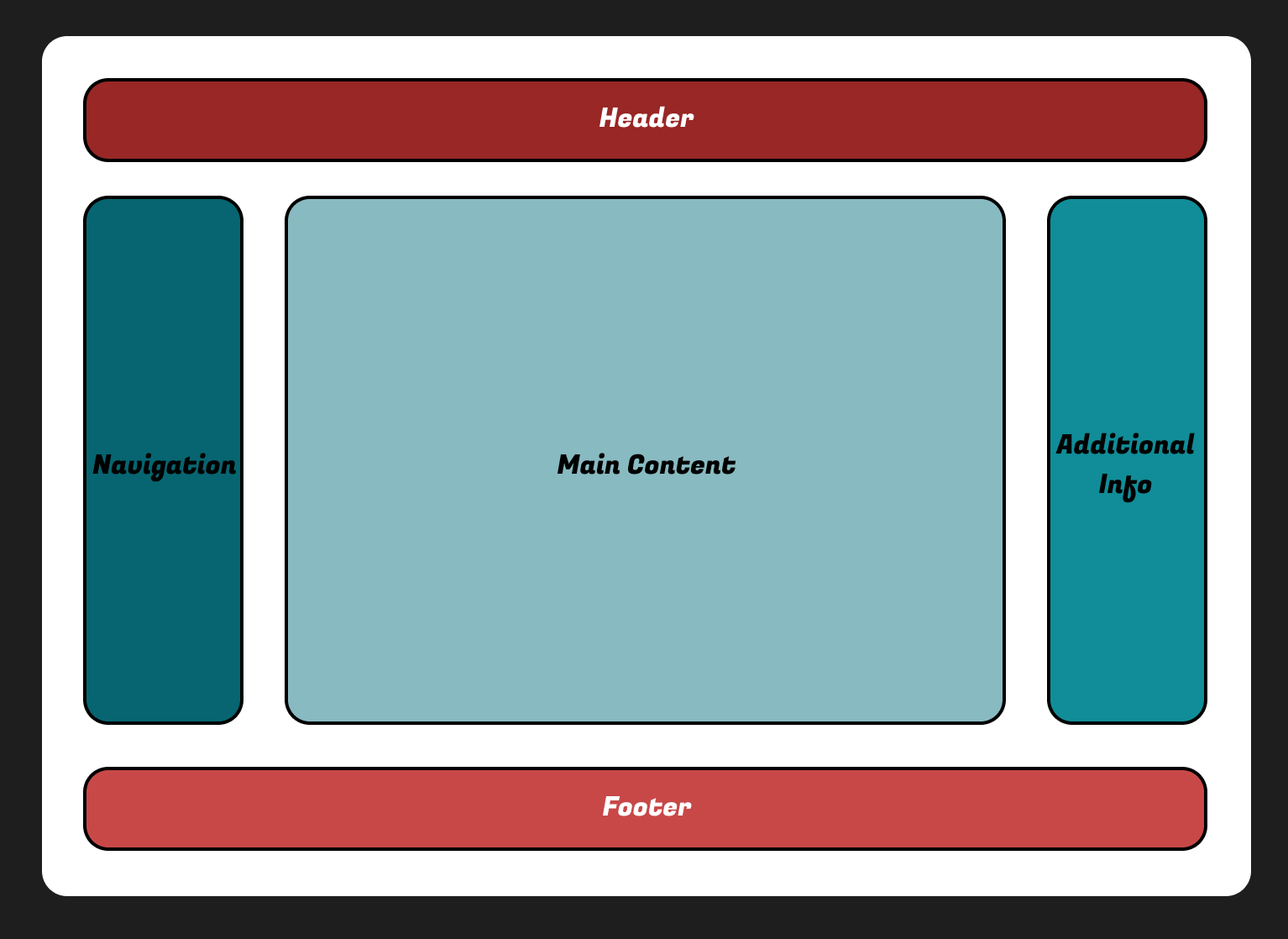
- While developing the sites design structure (header, navigation, main content, footer, additional info) you can think of the corresponding HTML landmark elements to use as well:
<main/><nav/><header/><footer/><aside/><section/>
- If you provide multiple similar elements (like more than one
<nav/>, don’t forget to individually name them (“main navigation”, “further reading”). - Try to use only one unique level one heading for every page that describes the content in a brief and concise way. This heading should correspond with the document’s title, the information you see in the browser tab where you opened your page.
- For all other sections of your content try to develop headings and their hierarchical order early. It’s important for all users to know what kind of information is provided in every section of the page. And the hierarchy of your headings appears as a “table of contents” to screen reader users which makes it easier to browse your content.
- Some visually obvious stuff needs more context, especially for blind screen reader users. This often can be provided by visually hidden headlines or labels, depending on context and location on the page. But beware:
- Those hidden things are hard to test and often forgotten in testing routines.
- You start to create a hidden parallel world with that technique. So use hidden content wisely.
- Not all screen reader users are blind! Hidden content only aurally available may confuse them.
Navigation and Orientation
Users should be able to easily find content on your page via intuitive navigation mechanisms.
- Pro tip on navigation: Don’t reinvent the wheel here. Web navigations are most usable when placed on the left (at least in a left to right reading system) or as a horizontal list on top of the page.
- Implement a breadcrumb navigation to help users determine their current location. Always try to implement alternative ways to navigate your content.
- If you are expecting a large amount of information, consider implementing a search function to provide a fast and easy way to find special content.
- Try to plan for skip links early. Although they may only appear to keyboard users, make an architectural plan for them in your markup. Place them at the beginning of your website to make sure users can skip repeating structures like headers, banners, long link lists or logos and jump directly to important content sections easily. Skip links can make life a lot more comfortable for keyboard or switch device users. Try to identify large amounts of content, like teaser lists or long link listings that are followed by interactive mechanisms like pagination or similar. A skip link to that pagination prevents keyboard users from multiple tabbing all over the list.
- Avoid linked phrases like “click here” or “read more”! Screen reader users can navigate by an overview of all links on a page. Out of context link texts like “continue reading” do not make any sense. Use brief and clear phrases instead.
Readability is King
- Consider a minimum font size of 12 pt (point). This would equal 16 Pixels or
1remis commonly seen as the best choice. - A maximum of 80 characters per line is considered best to read on screen devices. Check the width of all your text elements in your website. This is easily be done with this CSS one liner.
- Keep your texts as simple and short as possible. Avoid long sentences with many nested subordinate clauses. This helps people with cognitive disabilities or reading problems.
- Don’t forget to set the document’s language. This is one of the most common barriers caused by careless developers and maybe one of the most easy to fix. And it has a big impact: if you don’t set the language, for example screen readers may switch to their default language and the pronunciation of the read text may be confusing.
Example: 80 Characters per Paragraph
p { max-width: 80ch; }Example: set the Document’s Language!
<html lang="en">Text Alternatives for Visual or Audio Content
If you are planning to add images, video or audio to your web project, think of alternative text contents for them early in the selection process. Those alternative texts will enable machine readability of your purely visual or aural content. As a side effect, this helps you increase your findability over the web and make your image content better for SEO.
- All images need a good alternative text to describe the images content to your users.
Rule of thumb: if this image adds meaning to your content, describe it in a brief text to all users. If it’s only a decorative image, don’t add descriptive text to it. - If you want to add videos to your project, you will need three separate text alternatives for every video:
- Closed captions (similar to subtitles) of the spoken texts of your videos.
- Audio description of information in the video, that blind people could miss out. An audio description is an additional narration added to the soundtrack to describe important visual details that cannot be understood from the main soundtrack alone.
- Text transcription of the video. This is similar to a textual equivalent to the whole video (spoken words, description of important visual details). This can help mostly deafblind people who are depending on a Braille device, which makes it harder to jump back and forth in the video while running. Reading the video as a complete transcript is much easier for those people and it increases the findability and SEO of your video content.
- If you’re adding audio files to your project, you will need a text transcription of the spoken words in the audio file to help hard of hearing people understand the content, too.
CSS Architecture
- Use relative CSS length units for all static dimensions (like the width of a collapsible panel, the height of a logo or for font sizes) to ensure the content can be resized to at least 200% in the browser window without overlapping areas on the page.
em,rem,vh,vwetc. or percentage units.font-size,line-height,width,height,padding,margin,grid-gap,gap etc.
- Avoid background graphics for informative content or interactive controls (iconography for buttons), because they can be disabled by user settings like in Windows High Contrast Mode.
- Try to avoid icon fonts and choose SVG (Scalable Vector Graphics) for iconography.
- Avoid changing reading order! Things like this can cause accessibility issues:
flex-direction: row-reverse;grid-auto-flow: dense;- Using something like the flexbox
order: 3;orposition: absolute;to change an element’s visual order and make it different to its order in the DOM (Document Object Model). - Respect user settings! For example if your designer plans for animated elements on your page, consider users that don’t want animations and have set their settings according to that. See example for “unobtrusive CSS“ with user settings in mind.
- If you’re planning animated content that is scrolling or moving constantly on the page (for example a stock ticker or an advertisement banner), provide control options to stop pause or hide the animation.
Example: Respecting User Settings for Animations
  @media (prefers-reduced-motion: no-preference) {
    transition: width 0.25s ease;
  }
Conclusion
There is a lot to consider when starting a web project. Regarding accessibility, you can save a lot of time, money and trouble if you think about certain things in advance during the conception and include them in the preliminary considerations.
Further Reading
- Stephanie Walter: Accessibility for designer: where do I start?
- Denis Boudreau: Supporting the Design Phase with Accessibility Heuristics Evaluations
- Jesse Hausler: 7 Things Every Designer Needs to Know about Accessibility
- Kevin White, Shadi Abou-Zahra, and Shawn Lawton Henry: Designing for Web Accessibility