Call me morbid, call me pale
I’ve spent six years on your trailThe Smiths, “Half A Person”
Since 1995 web usability expert Jakob Nielsen recommended the use of breadcrumb trails as a secondary navigation scheme to help the users find their way through a complex website. And he can’t be wrong 22 years later as websites became more complex with different ways of navigation (e.g. off canvas menus, tabs, collapsibles, parallax scrolling etc.) and an uncountable number of different devices have access to them nowadays. Still they help users in those modern times.
TL;DR
See the final result here with the working code examples.
Quick Overview on the Key Benefits to User Experience
- It encourages browsing (click-through rate) and therefore reduces the bounce rate, because even random visitors can immediately understand the context of the content featured there.
- As a visual aid it reduces the users subconscious fear to get lost on the site and losing too much time finding valuable content.
- It reduces additional clicks on the way through a site and can help users to locate themselves inside the website hierachy.
- It supports content findability because its hierarchical order lets the user (and of course search engines) understand the website’s structure.
- It is always a plus in effectiveness and efficiency, because it can reduce the number of actions needed to complete a task.
Design Principles for best User Experience
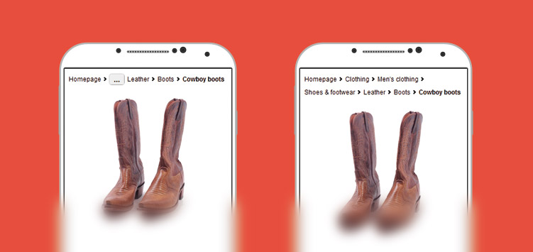
- Breadcrumbs should always show the whole path of navigation and in any case start with the homepage. Leaving out certain levels can confuse users (with a slight exception for mobile breadcrumbs).
- A good breadcrumb trail should be on top of your main content but below the main navigation, because it is the secondary orientation aid.
- Use reduced font size and make its design less noticeable. It should not be in a visual rivalry with the primary navigation or even feature similar design patterns.
- The current level in the breadcrumb should be visually (and of course semantically) highlighted by a bold typeface.
- Use the full page titles in breadcrumb if possible so the users can easily find out, where the links lead to.
- Use a “>” as a level separator. It’s became the best understood separator symbol, because it easily and quickly gives an impression of hierarchy between two expressions. And it’s the most commonly used symbol. The W3C recommends using a “→” symbol though, because the “>” could be mistaken by some users, for example in mathematical contexts where this means “greater than”.
- As a best practice let the URL be a mirror of the breadcrumb. If you show consistency between the two paradigms, you have all the users on your side.
- Hierarchy (path) based over history based: hierarchy is the most common basis of breadcrumbs. History based ones are not necessarily understood by the users, because they can be confusing and only duplicate browser functionality.
Breadcrumbs and the Mobile User Experience
I often came along a very quick and unreflected answer to that: “If you need a breadcrumb trail in your mobile website, then something is wrong with your site architecture. It’s simply too complex.”
Aha. Feels like a Catch-22. I mean, why should mobile sites not be complicated and deeply nested in their architecture? This is just an ignorant view on the reality of complex structures like information provided by the government, communal services or multi national companies.
There still is this fairy tale around that mobile users don’t browse and are always on the run without time to really witness the content. This is simply not true. Mobile usage is everywhere, every time. Many users have already given up on desktop computers or laptops in favour of mobile access to the information they are looking for. And they might need help to find information as well.
From a design perspective you will pretty soon come to a point, where there is no more horizontal “screen real estate”. And the key visual of a breadcrumb is its horizontal offset that lets you easily understand the hierarchy paradigm lying behind it. And you should not in any case sacrifice that for a vertical pattern! A vertical aligned breadcrumb path would just be mistaken too easy for a part of the main navigation or a collapsed selection list.
I discussed this with several usability engineers and we came to the conclusion, that there is a strong need for the horizontal pattern, even in mobile devices. After some tests we decided to make the breadcrumb horizontally collapsible when it features more than 4 list items. This was a strong compromise to keep that pattern alive and not spend too much vertical space. You will find a working example (breakpoints below 480 Pixels) ont the bottom of the article.
But how can we code a breadcrumb trail as inclusive as possible?
Breadcrumbs and Accessibility
The WCAG 2 recommends to “make information available about the user’s location in a set of web pages”. As the most common technique the WCAG sees this to be done by providing a breadcrumb trail. It advises to use them especially on complex sites with a deeper structure, when you are not able to communicate the current location to the user with other techniques. This is one reason, why this site here has no breadcrumb trail.
Visual Semantics vs. hidden Hints
The horizontal paradigm of a trail made of links is as important for the visual user as is the underlying hidden text that says “you are here” for users with assistive technology. Both patterns help them understand the meaning behind our list of links. And I would recommend to leave the “you are here”-statement hidden, because it is unnecessary for visual users.

Ordered Lists over nested Lists
There was a lot of hassle about a breadcrumb’s correct markup. Some people say, that it’s semantically wrong to code it in a plain unordered list. They point out, that it has to be a nested list with every new list item. I must admit that this feels right on first sight, because it represents the correct hierarchy and depth of the navigation and it would be the same way you would code it in the main navigation list, without all the siblings though.
<!-- Do not copy this! It's just an example how to NOT code it! -->
<nav class="breadcrumb">
<h2>You are here:</h2>
<ul>
<li>
<a href="/" rel="index">Homepage</a>
<ul>
<li>
<a href="/mens/">Men's clothing</a>
<ul>
<li>
<a href="/mens/shoes/">Shoes & footwear</a>
<ul>
<li>
<a href="/mens/shoes/leather/">Leather shoes</a>
<ul>
<li>
<a href="/mens/shoes/leather/boots/">Boots</a>
<ul>
<li>
<a href="/mens/shoes/leather/"><strong title="current page">Cowboy boots</strong></a>
</li>
</ul>
</li>
</ul>
</li>
</ul>
</li>
</ul>
</li>
</ul>
</li>
</ul>
</nav>But have you ever tested that in a screen reader? The user experience is just awful because it announces every single new item as a new list and then the item itself. Here is how some major assitive technology reads a nested list:
Chrome Vox
“List with one items, List item ‘Homepage’, List with one items, List item ‘Men’s clothing’” etc.
NVDA
“List with one item ‘Homepage’, List with one item ‘Men’s clothing’” etc.
JAWS
“List of one items, bullet, link ‘Homepage’, List of one items, nesting level 1, bullet, link ‘Men’s clothing’” etc.
It would take up to minutes to read a longer breadcrumb then. And it just feels completely over engineered.
So I decided to code it as a plain but ordered list, to minimize the semantic overhead here. This allows you to still figure out, what level you climbed. And this just seems to be what most screen reader users want it to be like.
The Current Page Paradigm
You might have recognized, that the current page is not linked. SEO might be one argument for doing so. You will want to save up links on the page, because every link that is set on one page reduces the value of the others.
And linking a page by itself does just not make sense. When a link leads to the same page, this will be confusing to all users. So this would be an accessibility issue as well.
If you leave the current page unlinked, this is a semantic statement as well, which helps to differ this page from the others. Additionally to highlight its importance, it’s a good practice to wrap the current page title in a <strong> element. But don’t forget to place a title="current page" or somethin similar on that to help mouse users here.
aria-current
With the new ARIA 1.1 Standard we are finally offered a very powerful semantic tool to highlight the current page / location in a navigation or a set of pages (e.g. pagination, dates in a calendar etc.). Although it is yet not very well supported (mostly in JAWS, February 2017), its usage is valid HTML and it has no side effects on the web page. But you should keep to the additional semantic highlight by not linking to this page, as described above.
If you don’t want to use this new ARIA tool there is still the commonly supported possibility to sign out the current page with invisible explanatory text for screen readers. But do not combine it together with aria-current. One semantic hint is enough.
...
<li>
  <strong title="current page" aria-current="location">Cowboy boots</strong>
</li>
...
Or:
...
<li>
  <strong title="current page"><span class="invisible">Current page:</span>Cowboy boots</strong>
</li>
...
And to keep the “semantic noise” low, you should use a hidden separator symbol like an SVG. Otherwise some screen readers might read “greater than” before every new navigation level, which is useless information in an ordered list and can be confusing at the same time.
...
<li>
  <a href="/clothing/mens/shoes/leather/boots/">Boots</a>
  <svg class="arrow" aria-hidden="true"><use xlink:href="#arrow"></use></svg>
</li>
...
More explicit Semantics
Is that all that we can grab out of our semantics treasury? An old HTML classic helps us out: the rel Attribute.
rel=”prev”
Wouldn’t it be nice to set rel="prev" on the list item link before the current page? This indicates, that the linked document is part of a sequence and the link leads to the previous one in this row. You could argue now, that it might better fit in a pagination list, where you could put rel="next" and rel="prev" on the buttons, that are commonly placed to the left and to the right of the pagination links. But why should a breadcrumb itself not be understood as a sequence of links (which it obviously is)? In my opinion, the rel attribute enriches the markup correctly and the breadcrumb is a good usecase for it. At least it helps the quality of your SEO.
...
<li>
  <a href="/clothing/mens/shoes/leather/boots/" rel="prev">Boots</a>
</li>
<li>
  <strong title="current page" aria-current="location">Cowboy boots</strong>
</li>
...
rel=”index”
And what about rel="index"? Wouldn’t it semantically make a nice addition on the homepage link? Actually no, because it means that the so enriched link points to a page where you can get an index for the whole website, which is not true in most cases. And on the other hand, this attribute parameter is deprecated with HTML5. So please don’t use rel=”index”.
And there is more SEO Benefit…
Search engines see a very high significance in breadcrumbs. Google enabled them in the search results some years ago and even patented this technique. If you want to make sure that search engines understand your breadcrumb, you should use the specific microdata provided by schema.org.
<nav>
  <h2 id="breadcrumblabel" class="invisible">You are here:</h2>
  <ol aria-labelledby="breadcrumblabel" itemscope itemtype="http://schema.org/BreadcrumbList">
    <li itemprop="itemListElement" itemscope itemtype="http://schema.org/ListItem">
      <a href="/" itemprop="item">Homepage</a>
      <meta itemprop="position" content="1" />
    </li>
    <li itemprop="itemListElement" itemscope itemtype="http://schema.org/ListItem">
      <a href="/clothing/" itemprop="item">Clothing</a>
      <meta itemprop="position" content="2" />
    </li>
    <li itemprop="itemListElement" itemscope itemtype="http://schema.org/ListItem">
      <strong title="current page" itemprop="item" aria-current="location">>Men's clothing</strong>
      <meta itemprop="position" content="3" />
    </li>
  </ol>
</nav>
After crawling it, they will show your site in the correct hierarchic order in the search snippets. This appeals to all search engine users and raises the click rate on this specific search result item, because it shows the context of the content they have found here, even with less information in the provided description text.
Google explains best how to code it properly. And you don’t have to test this live on your site. Google provides the so called Structured Data Testing Tool to check your microdata enriched code. But be patient. The breadcrumb style search snippet is not created immediately by Google. It depends on crawl rate and other factors you can not so easily control “onpage”.
There is another benefit to that: it enriches the semantics of your code but does not harm the reaction of a screen reader to that. They simply ignore this “semantic overhead”. But future usage by other tools is possible.
Keywords Boost
Additionally breadcrumb trails can help to strengthen the keyword density of your webpage in a healthy way. They are the most natural solution to place them linked into your content without any suspicion of keyword stuffing.
Reducing the Amount of Crawl Levels
As another plus breadcrumbs can enhance the crawlability of your site. They possibly densify the site structure for search engines, because their robots will need a lower amount of crawl levels to reach every site. Combined with a deep link to the lowest level the click depth and crawl level will be reduced on the deeper navigation levels.
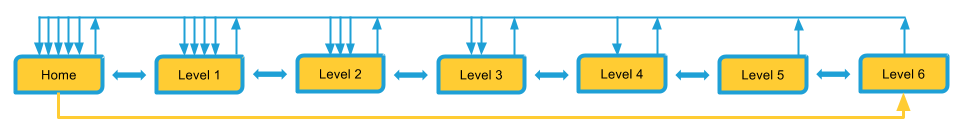
Here you can see this effect in a table view:
| Homepage | Level 1 | Level 2 | Level 3 | Level 4 | Level 5 | Level 6 | |
|---|---|---|---|---|---|---|---|
| Crawl Level before | 0 | 1 | 2 | 3 | 4 | 5 | 6 |
| Crawl Level after | 0 | 1 | 2 | 2 | 2 | 2 | 1 |
Final result
Here you can see the complete thing in action:
See the Pen Breadcrumb trails – a best practice by Accessabilly (@accessabilly) on CodePen
You can find the working example and the source code of it here. Try breakpoints below 480 Pixels as well.
If you want to download the code directly, refer to my Github repository page.
Further Reading
- Léonie Watson on using the aria-current attribute.
- W3C gives us a ARIA Breadcrumb Design Pattern Example