Any man could get used to
And I am the living signThe Smiths, “Vicar In A Tutu”
Microinteractions consist of the subtle feedback moments in small single tasks, for example a light switch. The light bulp itself returns the feedback immediately after the switch is used. Another example might be vibrating cellphones when you receive a message. This haptic feedback is so powerful you even feel it, if the phone is in your pocket.
TL;DR
See the final result here with the working code examples.
Why rely on microinteractions?
Microinteractions are the power behind small interactive user interface components and make the whole application appear more human. They connote empathy behind the machine you are interacting with. From a design perspective they are the feel in “look & feel”.

Thinking of iconic microinteractions components like the Facebook like button or the Tinder swipe user interface we can say without exaggeration that a brand can be created here. And on the other side a whole application or product could fail, if you would remove or crash those important little triggers that keep people connected to the machine.
What makes them interesting in terms of accessibility? Mostly, interactive elements are designed for visual users and tend to lack feedback for users with assistive technologies. Although in most cases microinteractions only need a little more effort to be inclusive to all users.
If people with disabilities were kept in mind during the process of development this little gadgets can have huge benefits to the user:
Returning instant feedback
With microinteractions the user does not have to wait for a whole page reload, because with Ajax technology all loading process can be fastened and hidden in the background without rendering the whole site.
Give the feeling of safety
With the ability to hint a user to do the right task and offer a certain guidance through small processes, users tend to feel safer. They can make long captions or explanatory text unnecessary and therefore explain the application to the user in a playful way.
They generate joy of use
They can help minimizing user efforts by a maximum benefit. For example Google’s autocomplete is by far the core feature used while searching because it is fast, efficient and self explanatory.
Or Facebook’s notification badges that subtly work like a user gratification in a way that many people like what you did and they activate a “desire for more”. With this little badges Facebook cements user loyalty in a very clever way.

Special benefits for people with disabilities through microinteractions
- If designed right microinteractions can bundle user focus to specific areas on the page or application and can make people concentrate on the tasks they want to manage.
- For people using screen magnification software they can be the perfect solution because they tend to concentrate on a small specific area.
- People with visual field loss can have the same benefits when microinteractions facilitate their focussed view on small screen areas.
- With microinteractions people with cognitive disabilities are not overloaded with feedback information on small tasks when the language used is kept understandable and quickly comprehensible.
- Microinteractions can help people with motor disabilities to avoid difficult interactions and reduce scrolling effort to get the information they are provided by the application.
- If the design combines symbols and graphics with text and follows semantic rules, microinteractions can also be a joy of use for people with auditory disabilities.
Statii for everyone
In the following example I would like to show you, how easy a nice microinteraction button can be designed which could be useful for everyone.
Let’s assume, we want to design something like a submit button, that sends an e-mail or other data to the server. And without overloading the user with server roundtrips and annoying feedback messages displayed somewhere over the screen, we would like to create a button, that keeps all the information that is provided throughout the submit process in itself.
First let’s figure out, what meaningful messages a submit process can handle to the user.
Some thoughts on wording, symbols, animation and color
Wording
The wording can be tricky here, because it is necessary to have simple words to rapidly explain what is going on, even to the sighted users. Considering the content, the wording should be descriptive and not too technical here, e.g. use “Send E-Mail” rather than a non explanatory “Submit”.
On the other hand we don’t want the button to be changing it’s extents to longer text and prevent it from glitching. So I chose visibility:hidden over display:none for the different statii to keep the button’s width to one size.
Symbols
In my example, I tend to add an indicator like a symbol for sighted and visually centered users, who like to orientate on icons and color more than on text. And I think, symbols should not be used alone without (or with hidden) text reference here because of two reasons:
- Symbols can have different meanings in different social areas. Their meaning is never self explanatory, so they can be the source of misunderstanding.
- You could argue, that we might enrich those icons with accessible tooltips, that explain the symbol. But the process itself is too fast for the user to trigger a tooltip (especially via keyboard) while running. And a tooltip would be flickering while changing its text, which can be annoying.
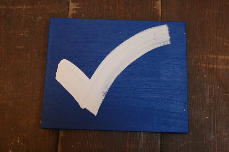
As a visual indicator for success I chose the check mark. Opposite to that I chose a triangle sign with exclamation mark for the fail status. I find those the most common and internationally accepted symbols for those statii.
Animation
Although that I’m aware that some people can be distracted or even confused by animation, I chose a subtle spinner animation in addition to the text “Sending” to connote, that the process of submitting the data is actually happening. This is in my opinion the most widely accepted visual semantic for this kind of “standby process” and it’s power to inform about the current state gives the user a positive feeling of knowing what is going on. The length of the animation should not exceed 5 seconds here to prevent people being confused by it.
Color
We all agree, that color alone can never be the right indicator to find out the current status. But combined with concise wording and almost self explanatory icons it can give this button a certain meaningfulness. So I tried to borrow the traffic lights color metaphor, which I think is the most universal to be used here.
And not least, design happens here. In my example, everything is kept raw, so you can choose your own design language. But keep it consistent all over the application and make sure, you use contrast enriched color combinations here!
Technical roundup
Some more infos about the technical details are necessary here.
Perception over performance
You might wonder why I wrapped the Javascript promises for “done” and “fail” in a timeout of 1500ms. Because it’s not a perfect world, I would tend to concede the user some time to read the status. I want to ensure the message to be concise as well. And I would like the button to behave in the same way, every time it is triggered, no matter how long this request takes. But the button should not keep it’s loading status longer than needed to store this data locally (Web Storage). Because in a perfect world you might store that data in a local storage container and transmit it to your server’s database when there is bandwidth and time for that. This creates a very smooth user experience and a feeling of reliability.
ARIA-enriched button
In my example, the button itself contains all the status messages already. You could also inject the messages via Javascript if you prefer that. But it is important to make the inactive statii at least visibility:hidden, so that they can’t be perceived. I added the role="status" to every single status message in the button to make sure, assistive technology is informed, when the status changes, respectively is visibility:visible again.
I discovered, that JAWS prefers, if text is injected via Javascript over changing visibility on the statii, especially if you don’t want to set aria-live="polite" and not aria-live="assertive". But in my special case, I want to keep the buttons width initially according to the longest message text nested inside.
I also discovered, that ChromeVox doesn’t like CSS Flexbox: it simply reads no status, if the container is set to display:flex. I only use that to align the text and the SVG icons in a row and center that content. So if you want to make sure, ChromeVox reads the statii correct, try display: inline-block and margin: 0 auto or something similar.
role="status" vs. role="alert"
All messages are set to role="status" except the initial button text, because semantically this is no status and only the button title. I made another exception on the failed message and set this to role="alert" because it is an error message and semantically this is the correct way to communicate errors. Compared to the ready status, it’s upon user to decide, if he wants to try it again.
Live Region ≠ Live Region
You might be wondering why I declare the outside button itself to aria-live="assertive". To mention it first: you can set this attribute on every HTML element you want. Although role="status" on the messages makes this an implicit live region as well, I discovered, that JAWS doesn’t read the changing status automatically without the additional declaration of a live region outside. And JAWS especially prefers the aria-live="assertive" and even ignores it if it is set to aria-live="polite".
Nesting statii
Nesting can be another challenge here: JAWS only accepts one level of nesting role="status" in an aria-live="assertive" region. And this also is different between browsers. So if you want to build your own microinteraction button of my example, make sure the statii are not additionally wrapped in a span or other HTML element between live region and status.
I add aria-controls to the button as well with all the statii ids in it, because it’s recommended to describe the special relationship between triggers and status messages. Every status contains the special status text and an additional span element that features the corresponding symbol.
SVG over Unicode
In my example I tried Unicode characters first for the symbols. But during testing I discovered, that some screen readers ignore the aria-hidden="true" nested inside a role="status" element and so read check or fail Unicode characters, which I found a bit annoying and maybe confusing for some users. Maybe it’s better to hide it with role="presentation" or role="none" here, but I have no test data on that. And of course you might have the same problems with so called “Icon Fonts”. Finally I chose SVG over Unicode to make sure, the symbols are not read at all.
Programmatically disabling the button
After clicking the button (or pressing the “enter” or “space” key on it), the submit process will be started immediately. At the same time, we have to ensure that the button can not be clicked twice or more times to avoid a bad user experience and maybe technical failure.
The easiest way to do so is putting a disabled attribute on the button. But when this is done, assistive technology no longer reads the statii nested inside. To prevent that, I put an additional class “disabled” on the button and make sure the clickhandler only works without this being set. Finally when all the process is done, I set the button to the semantically correct disabled attribute.
Other screen reader challenges
Screen readers were all tested under Windows 7, except Edge on Windows 10 and TalkBack on Android. You might encounter different results on other operating systems. I used everygreen browsers in their current version.
| Firefox 54 | Chrome 59 | Opera 64 | IE 11 | Edge | |
|---|---|---|---|---|---|
| JAWS |
works
|
works
|
doesn’t work | doesn’t work | |
| NVDA |
works |
works partly
|
works partly
|
doesn’t work
|
|
| WindowsEyes |
works partly
|
doesn’t work |
doesn’t work |
doesn’t work |
|
| Narrator |
doesn’t work |
doesn’t work |
doesn’t work |
doesn’t work
|
|
| ChromeVox | – |
works
|
– | – | – |
| TalkBack (Android) |
works |
works |
works
|
– | – |
I’m a little disappointed about JAWS which behaves like a diva and feels like the Internet Explorer of screen readers here. JAWS e.g. ignores the aria-hidden="true" if it is nested within the role="status". I don’t know, if this occurs every time, but it annoyed me here a lot and forced me to switch from Unicode characters as symbols for a quick demo to SVG, which is by far the better solution anyway. And it’s easier to let JAWS announce role="alert" than a role="status" for no obvious reason. But in my opinion, this would be semantically wrong.
The low support of a pretty old feature (role="status") in all the screen reader software is heartbreaking. I think role="status" is not so well implemented here. My feeling is, that most screen readers read role="alert", but sometimes ignore role="status" under certain circumstances.
The best choice for me would be Firefox in combination with NVDA, because it seems to react like expected and like it is defined in the web standards. NVDA and TalkBack on Android show the best performances across all browsers here.
Final result
Here you can see the complete thing in action:
See the Pen Accessible Microinteractions Button by Accessabilly (@accessabilly) on CodePen
If you want to download the code directly, refer to my Github repository page.
Conclusion
It’s pretty easy to design a nice microinteraction button that helps all users with interactive tasks on websites and applications. Though it’s not as easy to code here, using ARIA standards can help making the button inclusive to most users. But beware: the support in assistive technology is pretty poor and not consistent.
Further Reading
- Léonie Watson on screen reader support for ARIA live regions
- Naema Baskanderi on UI animations
- Aurora Harley on using animation for better untderstanding