And in the darkened underpass
I thought oh God, my chance has come at last
(but then a strange fear gripped me and I just couldn’t ask)The Smiths, “There Is A Light That Never Goes Out”
There is more to Web Accessibility than screen readers and machine readability. One of the more excotic topics there is user preferences via operating system or user generated style sheets. The more commonly known was introduced by Microsoft with Windows 7:
Windows High Contrast Mode (Win HCM).
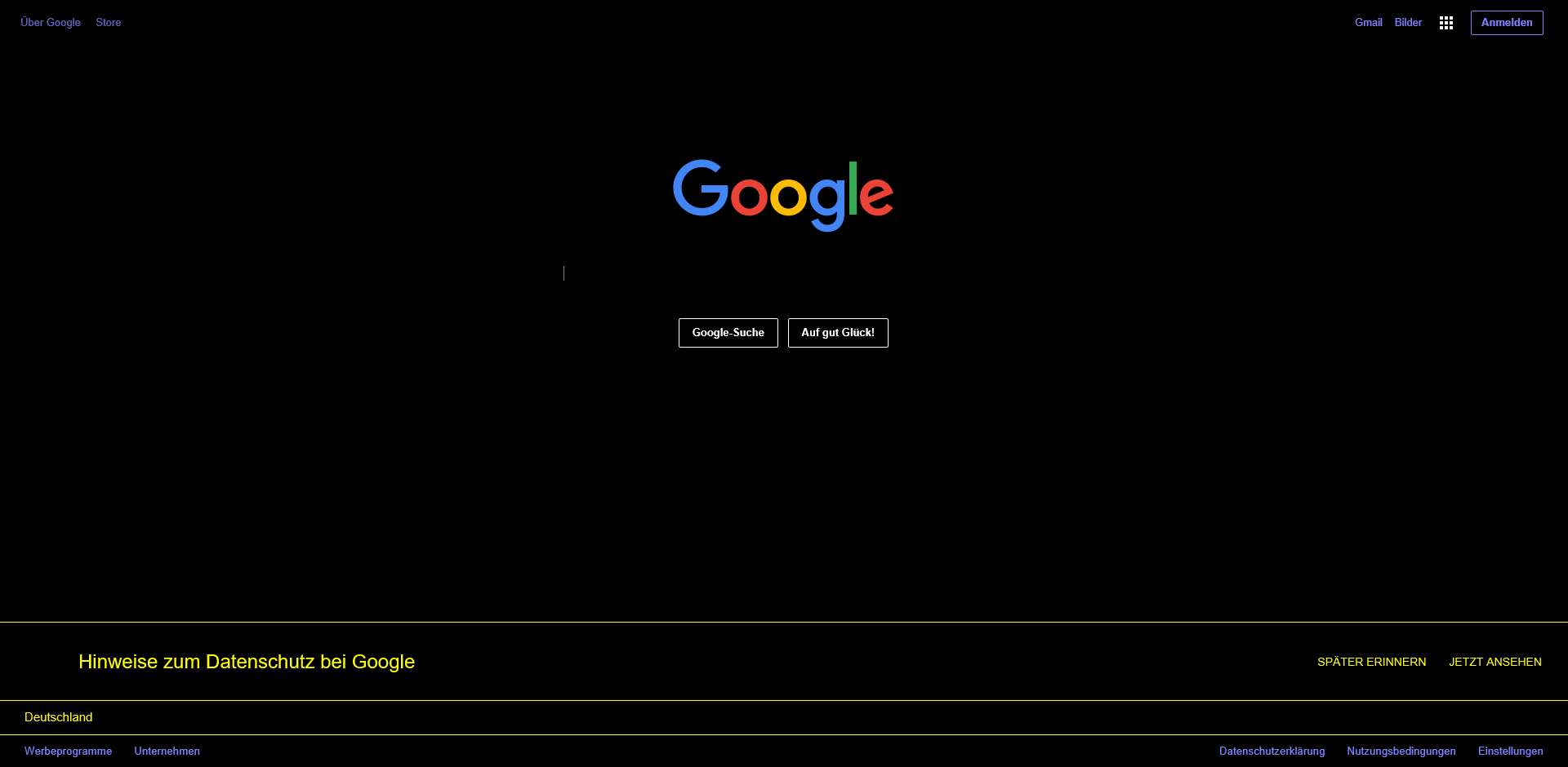
This is an alternative color setting that affects the entire operating system and the programs that support it when activated. It is available in the browsers Internet Explorer 10, 11, Edge and Firefox (if you activate Win HCM before you start Firefox or open a new tab there).
TL;DR
- Win HCM is a collection of user defined color themes that overwrite your definitions in CSS.
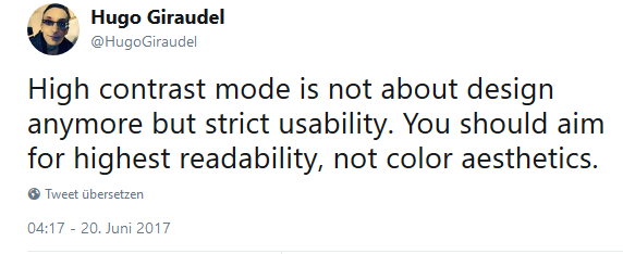
- It’s not about design but readability.
- Some stuff will disappear in Win HCM, some won’t. Best advice is to use semantic HTML to keep things visible.
- You can use transparent
outlineto keep things visble like focus indicators and surface boundaries or usecurrentColorto maintain SVGfillcolors in Win HCM. - You can use a special media query combined with special CSS color keywords to give elements the user defined colors.
Activating Win HCM in Windows
As it’s only available on Windows, I recommend to other users with a Mac or Linux system to install one of the virtual machines offered by Microsoft to test their stuff.
Start > Settings > Ease of Access > High contrast > On / Off
Or via keyboard shortcuts:
left Alt + left Shift + Print Screen

Or you can make your own Windows shortcut on your desktop:
Right click on the desktop > new > shortcut
Enter this as URL: ms-settings:easeofaccess-highcontrast
Who uses Win HCM?
There are no exact numbers, but Melanie Richards, a Microsoft program manager for Edge development claimed in her talk at View Source Conference on September 30th 2019, that 4% of all Windows machines run under WIN HCM. Assumed that there are about 1.5 billion Windows machines worldwide, this is around 60 million users (maybe a little less, because not all of them run Windows 7 or higher).
According to WebAIM’s 2018 “Survey of Users with low Vision”, more than 50% of the low vision users use High Contrast Mode.
Low vision can mean: some users who are not completely blind, but can only see to a very limited extent, e.g. have low vision in one eye while the other eye is blind. These users are often very quickly dazzled by bright screen content because they capture the content very close to the screen or use magnifying software to zoom into the screen. The regular black on white theme is very exhausting for those people.
The same can be said for people with migraine or people with Irlen Syndrome who can react very sensitive to light or special color combinations. Those might use Win HCM too in certain conditions.
Others who have dyslexia may find certain colors more difficult to read than others and like to have the same things always in the same colors, like links or buttons. To help them out, Microsoft invented the Win HCM, where they can define their own color scheme that fits their needs.
But it can affect all of us! I personally use the Twitter-App on my smartphone in night mode, because it is too bright for me, if I use it for a longer time. Or have you witnessed your GPS navigation system switching to night mode after the sunset? Did you ever use your smartphone, tablet or laptop in the bright sunlight? Here is the solution for extreme light conditions: you can just switch to Win HCM white theme and experience better contrasts for reading or working in sunlight.
And there is a health reason for activating Win HCM: studies suggest, that the exposure to the blue light of modern displays like laptops and smart devices can seriously damage retina cells. There are ways to prevent that via software driven blue light filters like the “night light” on windows, “night shift” on a mac and on iOS devices and “night mode” on Android. But using Win HCM could do the job, too.
And there are a lot of other reasons, people use Win HCM: a sound engineer, operating in the dark, a boy with autism to watch YouTube, or people, that just get tired eyes by the black on white contrast.
There is a tendency of changing display brightness and this can be controlled by developers in the near future with light level media queries.
Different Themes
There are 4 different themes to choose from. And every theme can be customized, so if black is to dark for you, you can change it to dark grey or anything else you want.

It’s not about Design but User Experience!
If you work on a web project and somebody else made the design for it, please handle her/his feelings with care. I really mean it! I recommend not to show screenshots or live view of the project in Win HCM to designers, without explaining what this is all about. Tell them, that this is not about her/his design anymore. That it’s a user defined override on the design, because the user has special needs. And that it’s only about readability.

Your custom High Contrast Switch Design is wrong!
It’s not about offering your own version of Win HCM, like a design theme to still have control over the design yourself. Like it was fashionable in the 2000s to the early 2010s to offer customized contrast setting switches on websites to address wrongly understood rules or best practices of web accessibility.
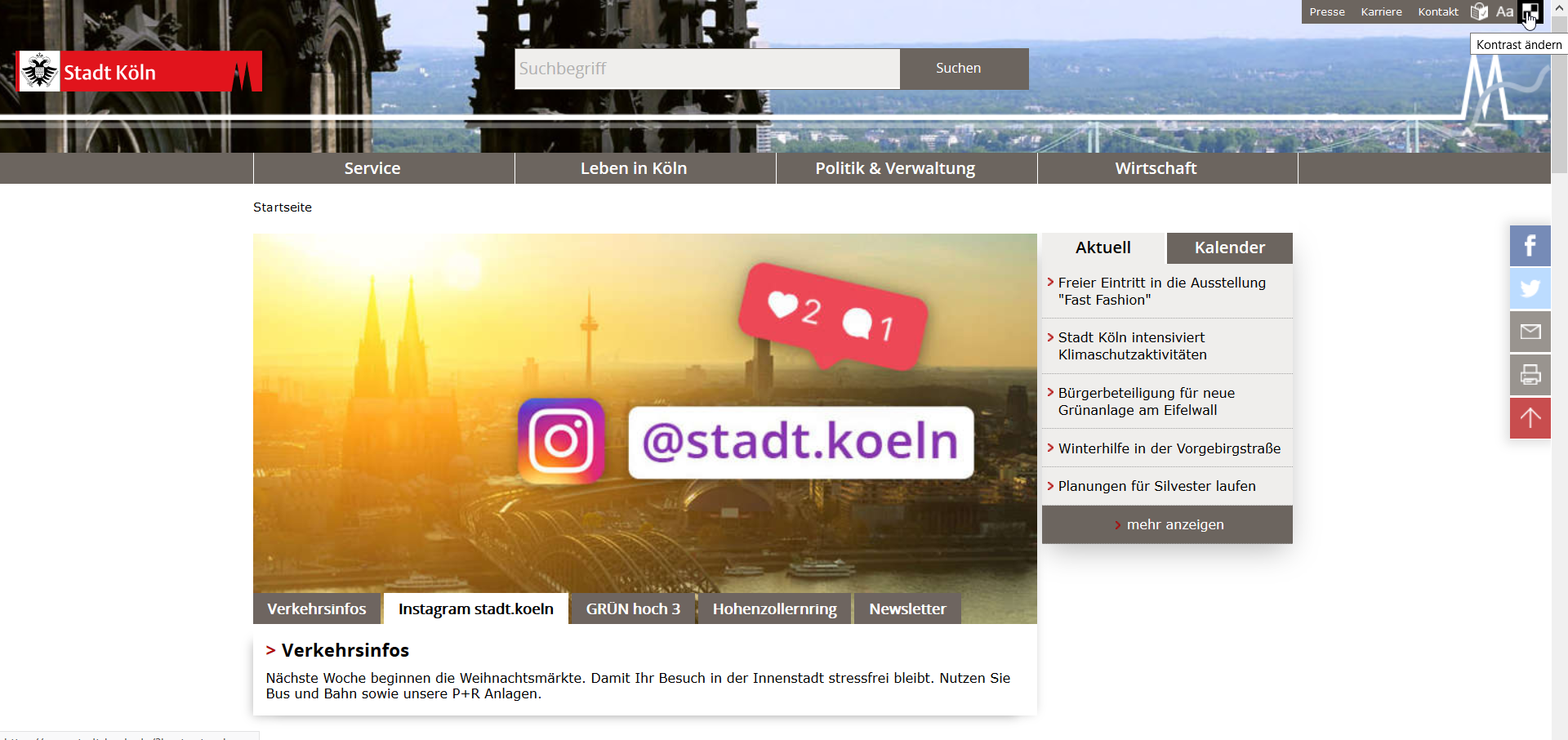
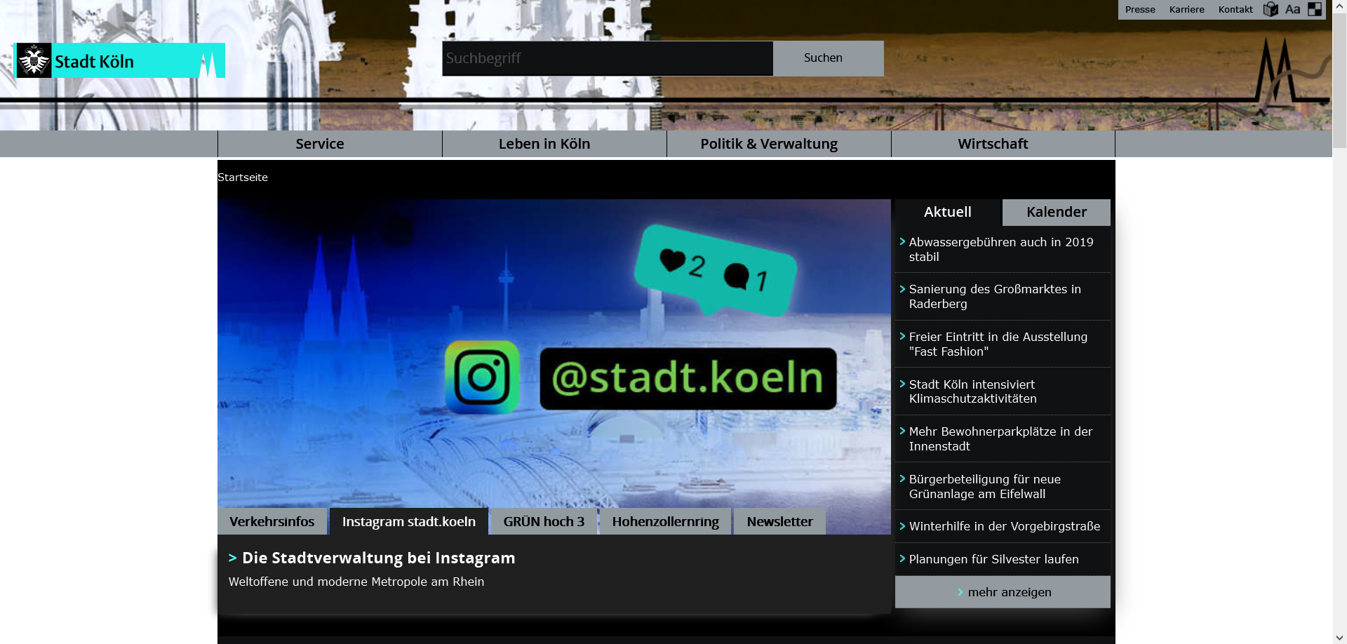
The city of Cologne offered a custom contrast switch on their site. But the effects result in leaving out background colors as huge white areas, that still might be dazzling to some users.


But changing contrasts should only be about user preferences. And user preferences should not be assumed or predicted by the author or designer. But both should assume that a user wants to override your principle design and offer the best ways to do so.
Why is this so important?
Users come with their own needs and some users have customized their settings in the browser or even in the operating system. WCAG 2.1 Success Criteria 1.4.8. is all about that and it just says:
Foreground and background color can be selected by the user.
This simple sentence carries a lot of meaning in itself. In the subtext it says, that all visual design decisions can be overridden by the user. But at the same time, all surfaces, texts, buttons, icons etc. must be perceivable to the same extent as without the users customized settings.
WCAG Success Criteria 1.4.1. can have an impact here, as well. It says:
Color is not used as the only visual means of conveying information, indicating an action, prompting a response, or distinguishing a visual element.
Color must be free of semantics. This means, the colour of a button should not determine its meaning. Not only because people have a different perception of color (e.g. color blindness), but users can bring their own color to the party.
What can happen in Win HCM?
Some things might look very different under Win HCM and some might disappear unintentionally. Please check out the following Codepen examples in Win HCM.
Colors change or disappear
As just said: please do not use color for semantic reasons. CSS color, border-color and background-color can change to user defined colors, not only in Win HCM. If you tell the user to press the red button, this button might be green in Win HCM.
See the Pen Windows High Contrast Mode fails: semantic Colors fade by Accessabilly (@accessabilly) on CodePen
What you can do to have semantic elements
- Use SVGs for semantic information, at best combined with text
Areas will blur
Some areas like columns, overlays or input fields and textareas, that are designed without borders and only differ from adjacent areas by their background color, may lose their visual outline and can not be determined as a connected area in Win HCM anymore. WCAG Technique C25 explains that issue more accurately.

See the Pen Windows High Contrast Mode fails: blurring Areas by Accessabilly (@accessabilly) on CodePen
What you can do to maintain your Areas
  .area {
    outline: 1px solid transparent;
}- WCAG Technique C25 helps you here: Define
outline: transparentin your CSS around the surface, which then will only be visible in Win HCM.
This is pretty harmless, because anoutlinehas no impact on the surfaces dimensions. - Define a
border: transparentaround the surface, which then will only be visible in Win HCM.borderoroutlineare preserved in Win HCM, although they don’t keep their originally defined color, but the color will differ from the background.
But be careful! Theborder-widthwill change the dimensions of your surface. It will stretch its outside or shorten the space inside, depending on what box model (box-sizing) you’re under. So don’t forget to reducepaddingorwidthandheightof your surface according to itsborder-width. - Make sure, any overlays like modal dialogs, flyout navigation or auto suggest in search inputs can have an
outlineorborderso they can be visually determined by other areas.
Focus Styles fade away
If you have unset the standard browsers focus indicator to outline: none and changed it to some fancy box-shadow as an alternative instead, this might be OK with the Success Criteria 2.4.7. “Focus Visible” in regular mode. But in Win HCM the box-shadow simply disappears. The same can happen, if you use background images, background colors, background gradients etc. Some clever CSS people might try to create something with :before or :after pseudo elements. But if they only rely on background-color and have no border or <code>outline, this technique will also fail.
See the Pen Windows High Contrast Mode fails: Focus Styles disappear by Accessabilly (@accessabilly) on CodePen
What you can do to keep proper Focus Styles
  :focus {
    outline: 3px solid transparent;
}- Additionally define
outline: transparentaround your element. This is completely harmless and the easiest way to have a proper focus indicator in Win HCM. - Or define a
border:transparenton:focus. But be careful with changing dimensions of your element then (see above). - If you need to set up focus styles on text elements like links or buttons, you can rely on
text-decoration(underlineat best) as well. It won’t disappear in Win HCM and keep the color of the text it is attached to.
SVGs can become invisible
In some cases, if you use inline SVGs as icons for buttons, as semantic indicators for data or similar stuff in a black on white context, they often are set to fill: black. In Win HCM this can make them invisible, because most time, the background is black by default there and the fill color won’t be overwritten. The same with to stroke colors.
All dark colors used in SVGs can be a problem (or light colors in High Contrast White theme), because this can fail WCAG 2.1 success criteria 1.4.11. for Non-text Contrast.
See the Pen Windows High Contrast Mode fails: SVGs become invisible by Accessabilly (@accessabilly) on CodePen
What you can do to keep your SVGs visible
  svg {
    fill: currentColor;
}- Heavily rely on
currentColorfor the SVGsfillproperty in CSS wherever you can. If you define an SVG as part of a link or a button, let its fill becurrentColorinstead of defining it new here. - If
currentColoris not possible, you may fall back on the Win HCM specific media query.
Eric W. Bailey has a great tutorial on how to keep your SVGs visible and contrasty in Win HCM with media queries on CSS-Tricks.
CSS Shapes might not work anymore
Chris Coyier once gathered a bunch of geometric shapes like arrows, polygons, stars, hearts etc. in his brilliant article on the different shapes created with CSS only. But most of them don’t work in Win HCM at all! That might be not so important, because we learned that Win HCM is only about readability. But if you would use those shapes as semantic indicators for stuff without additional text information, this can be a barrier for some people.
See the Pen Windows High Contrast Mode fails: CSS Shapes not working by Accessabilly (@accessabilly) on CodePen
What you can use instead of CSS Shapes
- Use SVGs instead (see above) an make sure, you style their
fillproperty withcurrentColoror via media query. - Use other inline images like
<img>and<picture>(this can be a performance issue though!). - Use UTF-8 symbols instead but make sure, they are not read by screen readers.
Semi Transparent Overlays are no longer transparent
If you are placing stuff over each other by using position: absolute and z-index or similar and make the upper layer semi transparent by using rgba as background-color or via opacity, its background-color will turn into Kubrickian black monolith in Win HCM and you can not see the underlying layer anymore.
See the Pen Windows High Contrast Mode fails: intransparent Overlays by Accessabilly (@accessabilly) on CodePen
What you can do to keep semi transparent layers
- Use the Win HCM specific media query to make your surface
background-color: transparentin Win HCM. - If you use this technique to place smaller elements on a bigger one (e.g. magnification buttons on a map), don’t put them in a surrounding layer with a
background-colorand try to position them absolute to a wrapping relative positioned container.
Background Images might vanish
Not so long ago, it was a common technique to use CSS background images (sprites) on special elements like buttons or links to add some semantic information. For example if you would want to create a language switch, some people used flags as a background-image sprite for each country. Or a company’s logo was set as a background-image to a homepage link in the header.
In Win HCM those techniques would all fail, because all background information is reduced to user specific color: mostly black as default, but it can be overridden by the user. The same thing happens, if you set it up as an base64 encoded inline background-image.
In Microsoft Edge since April 2016 background-image is (partly) supported and Microsoft introduced new media queries especially for Edge.
See the Pen Windows High Contrast Mode fails: intransparent Overlays by Accessabilly (@accessabilly) on CodePen
What you can do to keep your images visible
- The best advice would be to just avoid using
background-image. - Try to use the image inline as an
<img>,<picture>(which can be a performance issue) or<svg>element. - You can still use your image on :before or :after pseudo elements as inline
content, this can be a performance issue as well and result in flickering. - For styled list indicators (like custom bullet points) you still can use
list-style-image, which is preserved in Win HCM. - If the image has to be a
background-image, use the Win HCM media query combined with SVGs, changing their filters:filter: invert(100%)orfilter: contrast(400%). Adrian Roselli has a nice tutorial on this.
What does not disappear?
The following CSS properties and HTML Elements are safe from vanishing in Win HCM:
- plain text
outlinebordertext-decorationlist-style-typelist-style-image<img><picture><canvas><video>
What is possible?
Best advice is to use semantic HTML. Most colors are correctly set by default there.
Combined with Win HCM media query you can apply specific user color keywords to border, outline or color. All other colors are overwritten.
| Keyword | Content-Type |
|---|---|
windowText |
Text |
window |
Background |
highlightText |
Selected Text Foreground |
highlight |
Selected Text Background |
buttonFace |
Button Text |
<a/> |
Links |
Win HCM Media Query
Beware: this is a non standard prefixed media query and only works in Internet Explorer 10, 11 and Edge.
@media screen and (-ms-high-contrast: active) {/* All special rules for Win HCM here */}

@media screen and (-ms-high-contrast: black-on-white) {/* All special rules for users of black-on-white theme */}

@media screen and (-ms-high-contrast: white-on-black) {/* All special rules for users using white-on-black theme */}
You can also exclude stuff from being overwritten like this:
@media screen and (-ms-high-contrast: active) {
     body {
      -ms-high-contrast-adjust:none;
      background-color: deeppink;
      color: black;
  }
}
See example here. But be careful with that. As stated above, it’s about user defined readability! Let the user be in charge of the colors here and don’t try to design.
DIY: Tracking Win HCM users
There are no reliable numbers on how many people out there use Win HCM. But if you want to have some numbers and run your own website, here is a little trick how to track those users. In a Twitter conversation I had with Adrian Roselli, he brought up the idea of tracking users by just embedding a transparent pixel image via CSS:
@media screen and (-ms-high-contrast: active) {
  body:before {
    display: none;
    content: url('https://www.google-analytics.com/r/collect?v=1');
  }
}
See a working example here. You just have to connect this with you Piwik, Google Analytics or other tracking tool.
Conclusion
Keeping your stuff visible on the “Dark Side of Windows” is not rocket science at all. There are only a few tricks that you have to keep in mind while developing a website and not forget, that there are users that want to overwrite your design.
Read more
- Nick Colley: Supporting users who change colours on GOV.UK
- Patrick H. Lauke: Windows High Contrast Mode: the limited utility of -ms-high-contrast
- Adrian Roselli: OS: High Contrast versus Inverted Colors
- Greg Whitworth: How to use -ms-high-contrast
- Matthew Attkinson: How “invert brightness” can improve accessibility and help us use our devices
Talks
- Julie Grundy: Can you see that OK? CSS tips for low-vision accessibility
- Eric W. Bailey: Working with High Contrast Mode
- Hans Hillen: Dealing with High Contrast Mode, Custom Stylesheets, and Icon Fonts

Kathleen Bennett
I use the high contrast setting on Windows 10 the only problem I have is when I move the cursor onto the screen in YouTube the bottom half of the screen goes black when I move it to the side again it it reappears, in full screen the top and bottom half go black with a thin slit of the video you can still see playing in the middle when cursor on screen when the title at top and bottom reappear, as soon as you move the cursor to left or right all black disappears and you can see screen again this does not happen on BBC iplayer or any other video playing system only on YouTube.