I could have been wild and I could have been free
But nature played this trick on meThe Smiths, “Pretty Girls Make Graves”
To style especially the file upload is a real complex issue and you might stumble upon things like the Shadow DOM or Web Components, stuff that a regular frontend guy like me doesn’t want to be bothered with. But in the world of HTML5 and CSS3 we have been given enough power to get that fixed.
TL;DR
See the final result here with the working code examples.
First Steps
To enable upload files to your application or website you basically need three HTML elements: a <form>, a <label> and an <input type="file">.
I would like to start out with some basic HTML code:
<form action="#" enctype="multipart/form-data">
  <label for="fileupload">upload file</label>
  <input id="fileupload" type="file" />
</form>
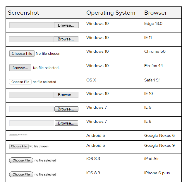
But as we all know, this looks quite lame in all browsers and it’s look is very dependent on what operating system you are using.

Styling the <input type="file"> is quite painful. There is a nice (but not too new) trick to get that done:
#fileupload {
  display: none;
}
.btn {
  font-family: Arial;
  font-size: 1rem;
  padding: 8px 8px;
  border-radius: 5px;
  border: 2px solid #265986;
  color: #ffffff;
  cursor: pointer;
  background-color: #265986;
}
.btn:hover {
  box-shadow: 0 0 5px #595959;
  background-color: #183a57;
  border-color: #265986;
}
What I did is just hide the <input> and style it’s corresponding <label> that it looks like a button. And the upload functionality still works pretty fine, maybe even in IE6 (not tested yet, though). That is, because it’s defined in the web standards, that a click on the <label> will activate the corresponding <input> element.
But is that accessible? Short answer: no. Especially for those reasons:
- Missing semantics: By just styling it you only visually make the label a button, but for users of assistive technologies it’s still a label. And it’s not obvious, that you can handle a hidden input element with that.
- No keyboard accessibility: Most users of screenreaders use the keyboard to navigate. But you can not focus the label by using your keyboard. You can only activate the input element with the mouse or with your fingers in touch devices.
So how do we make this a real button?
And by “real” I mean a button that is accessible for all users out there.
Let’s pour some semantic sugar on top
I put a <span> element into the <label> element and set role="button" on it. That’s just to provide correct valid HTML markup, because ARIA roles would not be valid on the <label> element.
Now a screenreader would read something like “button: upload file” here, just like on a regular button. With the addition of aria-controls="fileupload" we make sure, that assistive technologies know, what element is controlled by the button.
Add some web standards know how
To provide keyboard accessibility I set tabindex="0" on the <span> element. This makes the button focussable. Now you can tab on my fake button. Additionally I set the same behaviour as on :hover to the focus state to provide stronger visibility for keyboard users.
<label for="fileupload" id="buttonlabel">
  <span role="button" aria-controls="filename" tabindex="0">upload file</span>
</label>
But still, I can not use the button with the keyboard properly. A button usally reacts on special keys pressed when it’s focussed. Here we need to provide the same functionality for enter and space key.
Some Javascript (jQuery) magic
I bind the keypress and keyup events for the “enter” (13) and the “space” (32) key on it. To activate the hidden upload <input> element, I set a click on it, when one of the keys is pressed.
$('#buttonlabel span[role=button]').bind('keypress keyup', function(e) {
  if(e.which === 32 || e.which === 13){
    e.preventDefault();
    $('#fileupload').click();
  }
});
Now the button reacts like a real button, for screenreader users and for “regular” users.
Pimping the user experience
The raw HTML example above had some very helpful usability advantages: after selecting a special file I am able to see (and read!) the file name of my selection. To make this styled component a good alternative for the raw HTML version we should provide this as well.
I need to add some more HTML (and some CSS of course):
<label for="filename" class="hide">uploaded file</label>
<input type="text" id="filename" autocomplete="off" readonly placeholder="no file uploaded">
I recommend setting the readonly attribute on the input, because the user should not be able to be entering stuff manually here, only by choosing a file to upload. To provide initial feedback I added a placeholder attribute that tells the user, that he has not chosen any files yet.
With some more jQuery on top, this works pretty fine:
$('#fileupload').change(function(e) {
  var filename = $('#fileupload').val().split('\\').pop();
  $('#filename').val(filename);
  $('#filename').attr('placeholder', filename);
  $('#filename').focus();
});
This little jQuery example just picks the value of the #fileupload element when it is changed, sets it as a value to our new #filename element and wipes out some useless path information. We update the placeholder attribute with the filename as well, because otherwise VoiceOver in Safari will read “no file uploaded” again after the upload.
Final result
Here you can see the complete thing in action:
See the Pen A styled accessible file upload by Accessabilly (@accessabilly) on CodePen
You can find the working example and the source code of it here.
If you want to download the code, refer to my Github repository page.
Further Reading
- Léonie Watson on the correct use of the tabindex attribute:
The Paciello Group – Using the tabindex attribute - Mozilla Developers Network on how to use the role “button”:
MDN Using the button role

Wen
Your example here had the attribute of type set to text for the input element. Why isn’t it set to file instead?
Accessabilly
Hi there,
there is a input with type “file”, but it’s hidden. The text input is just for visually showing the filename.